Typography
A PDF of Bowie State’s typography guidelines is available for download. These guidelines includes guidelines for print, web, interior and exterior wayfinding and signage. Download the 2021 Typography Guidelines (pdf)
Overview
The words we choose for our communications are important. But the way we represent those words in type can make them even more meaningful. Consistent, thoughtful use of brand typefaces visually supports our verbal communications and creates a recognizable expression of our identity.
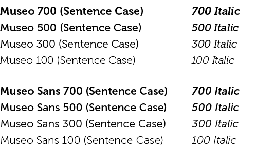
The Bowie State brand uses the two typefaces shown below and discussed in this section. With consistency as a goal, it’s important that these typefaces be used for all BSU marketing and communication efforts. On rare occasions, such as a promotional event, other options may be approved.
Primary Print Typefaces
Headlines — GOTHAM

Subhead — Museo Sans

Body Text — Museo and Museo Sans

Tables & Infographics — Museo Sans Condensed

Typefaces for Web
Headlines H1-H5 — Rubik Medium

Subheadlines H6 — Museo Sans 700, #666665

Body — Museo Sans 300
![]()
Frank Ruhl Libre Medium — Numbers for Statisitics
![]()
